

MALA
Deliverables
Brand Identity
Web Design
Brand Guidelines
Brand Communications
Brand Strategy
Project Partners

Enhancing environments.

The Brief
Mala are building services engineers, a design-led practice based in London with specialist expertise in the field of integrated engineering services. Established in 1971, Mala create, control and maintain all aspects of a building's environment.
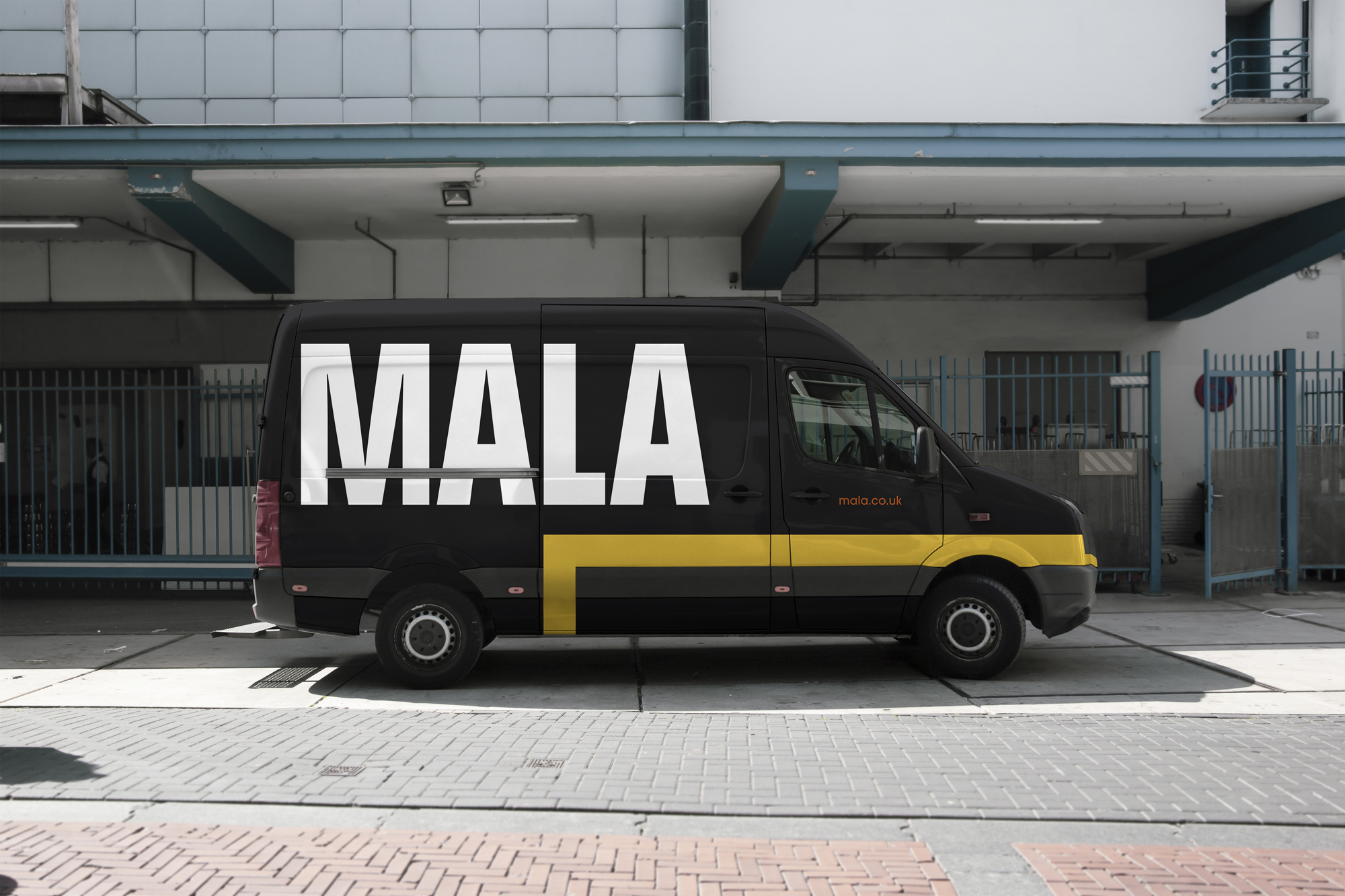
Following Mala's 50th anniversary, the business wanted to refresh their visual identity and online presence, with a focus on how the company now plans to look forwards, to the next 50 years. Motel were appointed based on our experience working with established brands – the task; to bring the existing logo up to date, from a period-style wordmark typeset in the early 70's using letraset, whilst retaining some of the individual characteristics and quirks of a logo well known in the industry. The black and white colour palette was favoured but everything else was open for exploration and suggestion. There was a strong desire to look current and digital in order to stand out amongst a competition of well established, and new, players within the competitive landscape, yet retain the qualities surrounding the origin of the former logo.
Our Approach
Motel began with a deep dive into establishing a new brand strategy and positioning for Mala carving out the who, what, why and how...
With a clear strategic path agreed we came up with three distinct visual creative territories, underpinned by the strategy, to base the new Mala brand identity around. The chosen direction saw the Mala typeface redrawn and modernised with a more condensed and architectural form, retaining similar bold qualities to the original logo.
Supporting typeface Avant Garde was paired with yellow and orange highlights creating a nod towards Mala's 1970's origin, referencing a modern take on design aesthetics of the era. Brand imagery was juxtaposed and set in monotone with sepia overlays to retain an overly neutral approach to colour.
A 'journey' line device was designed to fit with the linear lines of the logo wordmark to create a visual design system for Mala that helps demonstrate services and projects, with an underlying theme of the continual journey the business is taking – past, present and future. The brand device also hints at the infrastructure aspects of the work Mala do including cabling, pipe and ducting to name a few.
The new identity was applied to the design of a new website, corporate stationery and sales presentation together with a brand style guide to ensure consistency of future brand application.
The Results
We establish continually evolving, long-standing relationships.
"
"
MALA


Confident in your brand’s performance?
Download: 5 design-driven strategies on why your brand is essential for business growth.

